You probably have heard me talk about SCBWI here from time to time. It's the
Society of Children's Book Writers and Illustrators, and they are dedicated in helping people who are writers and illustrators to better hone their craft with the hope of getting published. I've attended several of the conferences they've put out, including one national and several local chapters. This past May I was honored to be a part of the faculty for our local chapter's annual gathering,
SCBWI-Oregon's Spring Conference. One of the highlights during the 2-day event was sitting next to
Lin Oliver during the faculty panel. I mean, really? C'mon,
the Lin Oliver? Executive Director of SCBWI? Sitting next to
me? It was a bizarre moment.
At one point, Lin leaned over to me and said how much she loved my work. She'd been looking at my postcards and portfolio and liked what she saw. She then asked if I'd be willing to illustrate a future Bulletin cover. After picking up my jaw from my lap, I said "uh, HECK YEAH!" No, actually I think I was a bit more subtle, but I was definitely floored and flabbergasted that she'd consider me as a future cover artist for them. I told her yes, it would be quite an honor.
So, fast-forward several months and I'm doing sketches for the cover. I had an idea that stemmed from talking with
Andrea about what to illustrate. See, each issue has a kite for its theme - the SCBWI logo features a kite, therefore every issue has had a kite featured either prominently or not so prominent on the cover. I wanted to do something vastly different, and not go any typical route, like flying kites up on a hill or something. After brainstorming with me for several minutes, Andrea at one point said, "Well, what about doing a mural?"
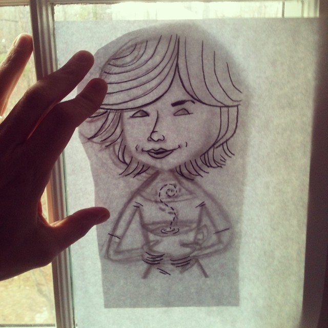
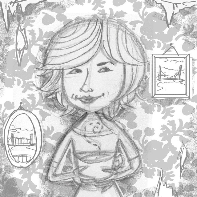
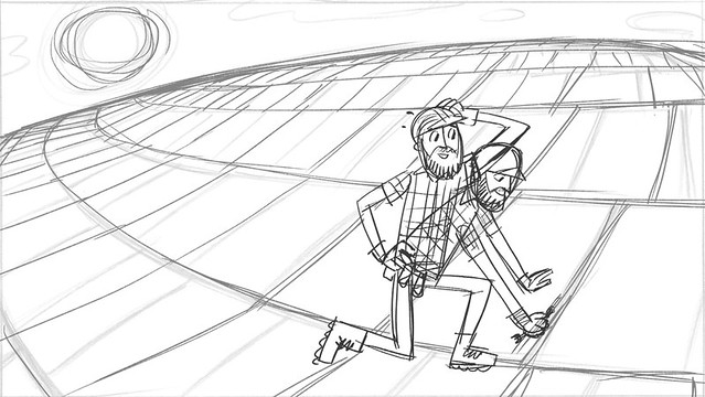
That's it. Something clicked in my head and I started sketching right away. Out of that session, I ended up with two main roughs that I sent to SCBWI for approval:
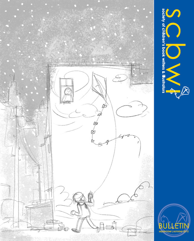
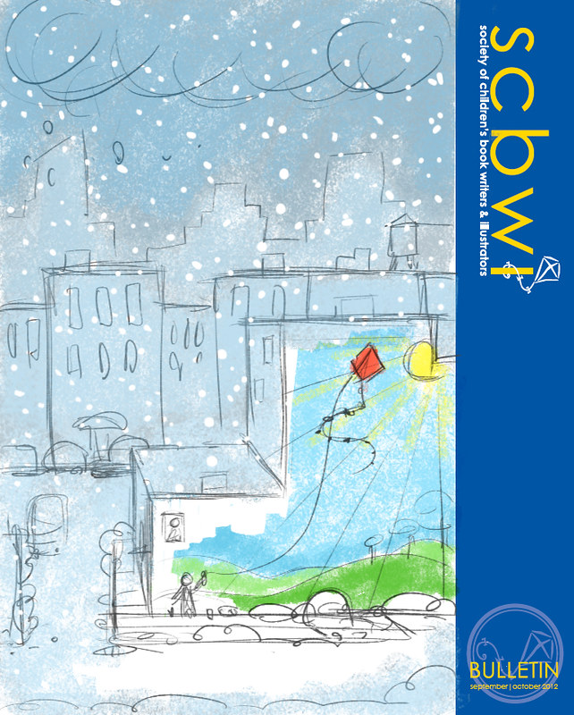
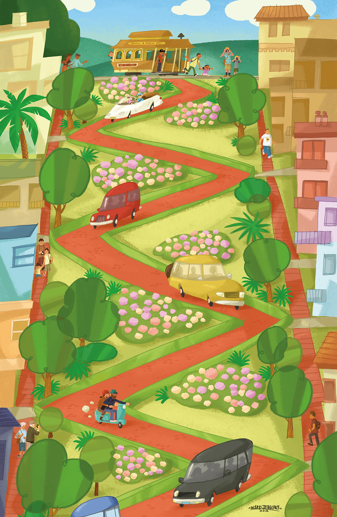
So, the idea would be that the mural would serve as a beacon of warmth and light in the midst of a blustery, wintery, snowy day, right in the throes of winter. Much like graffiti does in the middle of blighted areas: pops of color blooming like poppy blossoms in a stark, vast field. I was excited about this idea and was extra excited to work out a little visual play with the boy spray painting the kite's string, making it look like he was actually pulling the kite.
The version that was chosen was the top one - the lower point of view made it easier to see the large mural, as the other version felt less intimate. I thought that the impact of this colorful mural was getting lost. My SCBWI contact felt so, too.
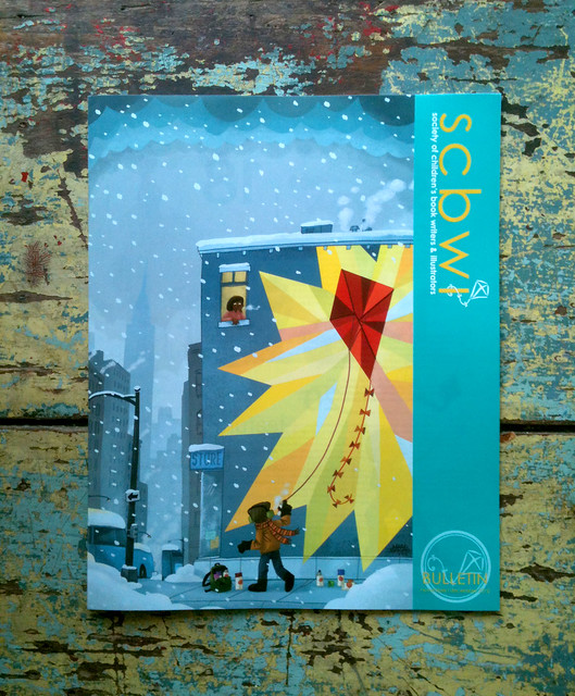
So, here's the final for you to check out, in all its brilliantly loud glory:
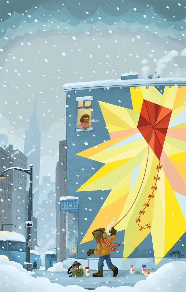
(By the way, please be sure to give credit if you decide to share with your peoples - many thanks!)
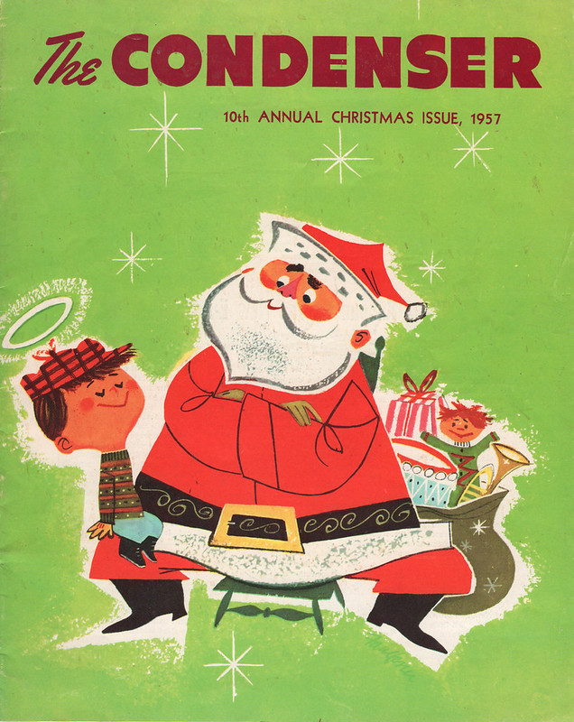
The Christmas season is upon us and I'm slowly but surely getting into the spirit of things here. Hope this gives you a little jolt of happiness, just in time for the weekend. Enjoy!